Rebranding Global Homeopathy, bringing you the latest holistic and individualistic healthcare for a wide range of chronic and
challenging diseases.
- Client
- Global Homeopathy Clinic
- Industry
- Medical
- Services
- Brand Positioning, Brand Identity, Logo Design
About Global Homeopathy Clinic
GLOBAL HOMEOPATHY was established in 2009 and has been providing homeopathic treatments for skin allergies, asthma, and other ailments in Mumbai, India, since 1989.

The Challenge
Homeopathy is a holistic healing method that often uses natural substances to relieve symptoms. Homeopathy has not reached the masses in a big way. It remains an untapped territory and is often misunderstood by those who have come across it.
Requirement
A complete brand transformation, brand positioning, brand identity, logo design, product repositioning, and revamp are needed to invite people to adopt homeopathy treatment for treating chronic and challenging diseases through a holistic and individualistic approach.


The Solution:
Brand Positioning:
We took care of their brand positioning by presenting them as the authority on homeopathy, i.e., the responsibility of educating people about homeopathy.
With these goals in mind, we invite people to the world of homeopathy in terms of:
- Cure through listening
- Awareness about homeopathy.
- Goal to invite through speaking out about your problems.
Brand Identity:
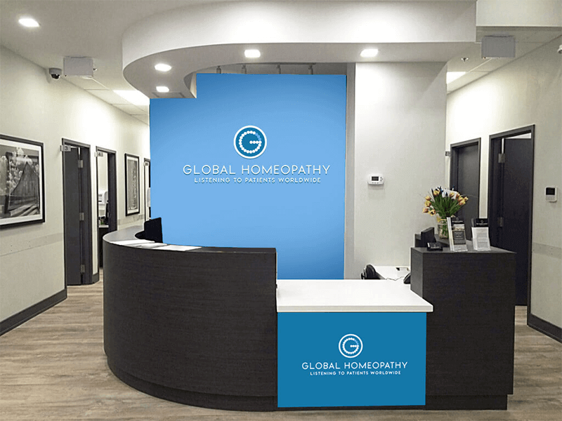
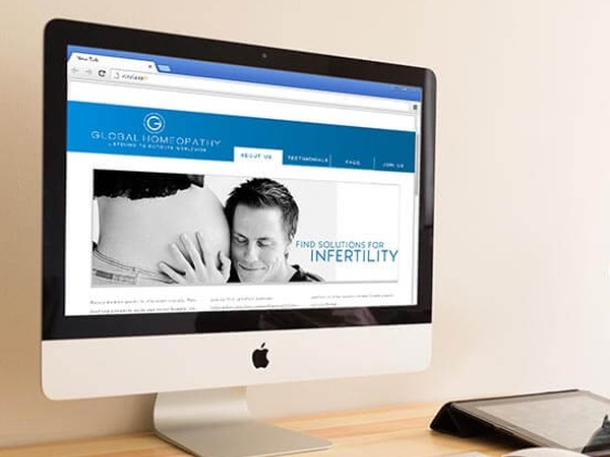
The rebranding process began with its very aim to invite people through speaking out about your problems. The cure was by getting to the root of the problem which comes through listening. Hence brand identity turned out to be – Curing chronic diseases by “Listening to patients worldwide”. We helped them redesign their business identity.
Brand Logo:
With a compelling new logo with an interesting theory, we created a design that makes them feel more compelling and reputable. It starts with a well-thought-out and evocative homeopathic logo design to make it a central point to create awareness and provide the right kind of information. The homeopathic logo was in the shape of the alphabet “G” and was adorned with homeo pills to give it a global feel. Additionally, the G’s design was such that it resembled the lock of a door being slowly unlocked to serve as an invitation to find out more and to ask questions.

Client's Feedback
Libcom brand was a complete brand transformation for us. They helped us position our company as an emerging leader, designed a bold and memorable logo, and repositioned our services to be more easily adopted by consumers. I would recommend them to anyone looking for the same type of work because they are great at what they do.
Dr Prabha Acharya
Director, Global Homeopathy